On Tuftefying gnuplot
Here are four examples of using gnuplot to visualize graphs in the style of Edward R. Tufte (see The Visual Display of Quantitative Information).
Quartile plot
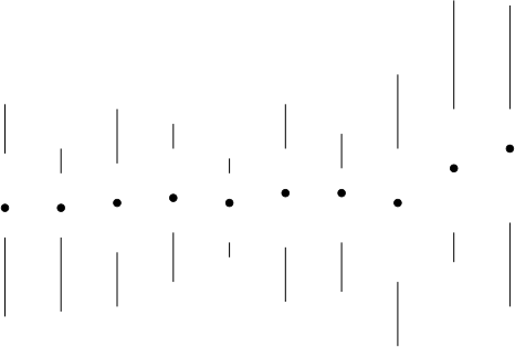
The first is a quartile plot from page 125. The data file has entries
x minimum lower-quartile median upper-quartile maximum
A quartile plot combines two vectors plots for the lower and upper quartile and a point plot:
#!/usr/bin/gnuplot
set term svg
set output "tufte.svg"
unset border
set noxtics
set noytics
plot [0:11] [0:10] "./tufte.dat" using 1:2:(0):($3-$2) with vectors nohead ls -1 notitle,\
                   "" using 1:5:(0):($6-$5) with vectors nohead ls -1 notitle,\
                   "" using 1:4 with points pt 7 ps 0.75 lt -1 notitle
The result is
Temperature
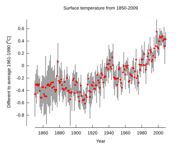
The next plot shows the development of the earth's surface temperature. The data is from the NASA Goddard Institute for Space Studies. Each line contains
year minimum average maximum
The graph again combines a vector plot to show the total range and a point plot for the averages. Note the rangelimit option for the axes.
#!/usr/bin/gnuplot
set term svg enh
set output "monthly-averages.svg"
set title "Surface temperature from 1850-2009"
set ylabel "Different to average 1961-1990 [{}^oC]"
set xlabel "Year"
set border 3 front linetype -1 linewidth 1.000
set xtics border in nomirror rangelimit
set ytics border in nomirror rangelimit
plot "./monthly-averages.dat" using 1:2:(0):($4-$2) with vec nohead lt -1 notit, "" using 1:3 w p lt 1 ps 0.6 pt 7 notit
Bar chart
Here is the redesigned bar chart at the bottom of page 127. The data are simple y-values, one per line:
value
and
#!/usr/bin/gnuplot
set term svg enh
set output "barchart.svg"
unset xtics
set style line 1 linecolor rgbcolor "white" lw 2
set style line 2 linecolor rgbcolor "#808080" lw 2
set border 1 ls 2
set ytics 5,5,15 border nomirror format "%.0f%%" font "Times_New_Roman,18" textcolor rgbcolor "black" offset -2 out scale 2.0
set grid front ls 1
plot [-1:11.25] [0:20] "barchart.dat" using 0:1:(0.5) with boxes fill solid 1.4 noborder ls 2 notitle
produces
Dot-dash-plot
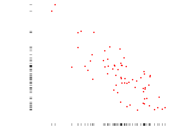
And finally, a dot-dash-plot in the style of p. 133. (The data are xy value pairs).
#!/usr/bin/gnuplot -persist
set term svg enh
set output "dotdash.svg"
unset border
set xtics textcolor rgb "white" out nomirror
set ytics textcolor rgb "white" out nomirror
set offsets 0.005, 0, 0, 1
plot "dotdash.dat" using 1:2:xtic(1):ytic(sprintf("%f",$2)) pt 7 ps 1 notitle
produces


